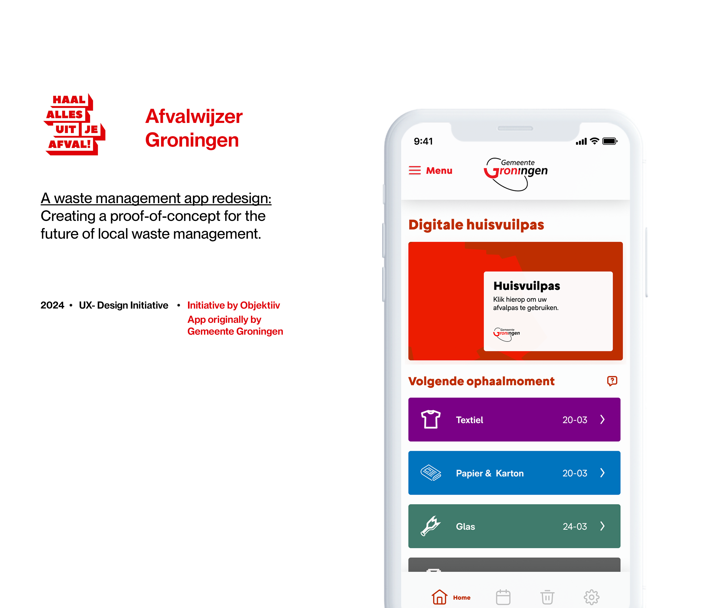
Empowering Groningen: How can residents be engaged in creating a trash-free city through a cutting-edge waste management app?
Challenge
What problem did we identify?
The Gemeente Groningen has earned a reputation for its forward-thinking waste management strategies. However, like many municipalities, it faces common challenges and areas for improvement.
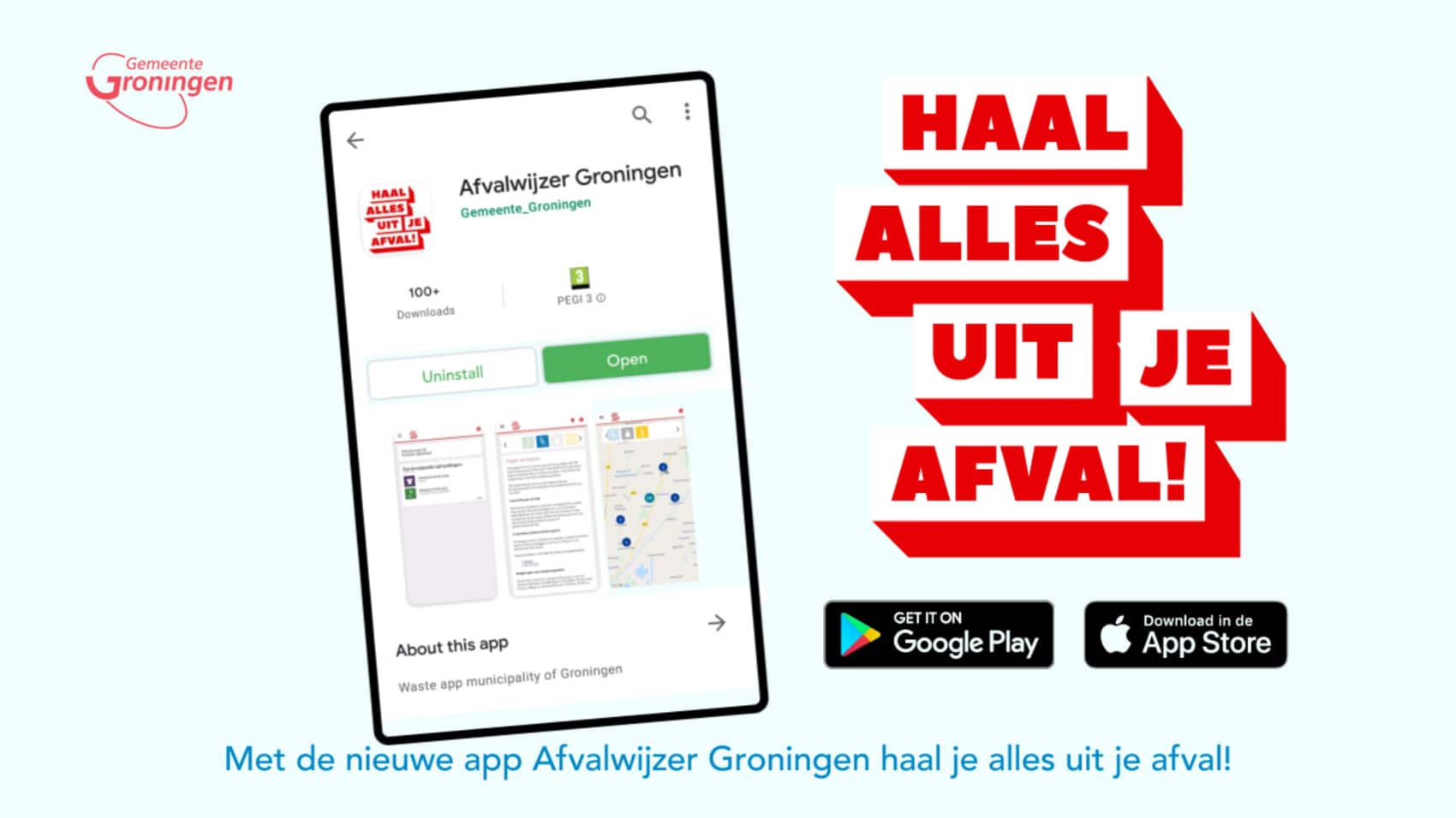
In 2019, the municipality introduced the Afvalwijzer ("Trash Compass"), a campaign supported by a mobile app designed to assist residents in recycling and waste disposal. Despite its innovative concept, the app has struggled to meet its objectives, falling short in both user engagement and functionality.
Identified Issues:
- Difficult Navigation: Key features such as the trash collection schedule and drop-off locations are challenging to locate.
- Non-Compliant Design: While functional, the app does not fully adhere to government guidelines for usability and accessibility in functional applications.
- Visual coherency: The application, though launched in 2018/2019, looks outdated from release in its visual design and doesn’t match other digital services of the Gemeente Groningen.

Our process
What steps are involved in the design process?
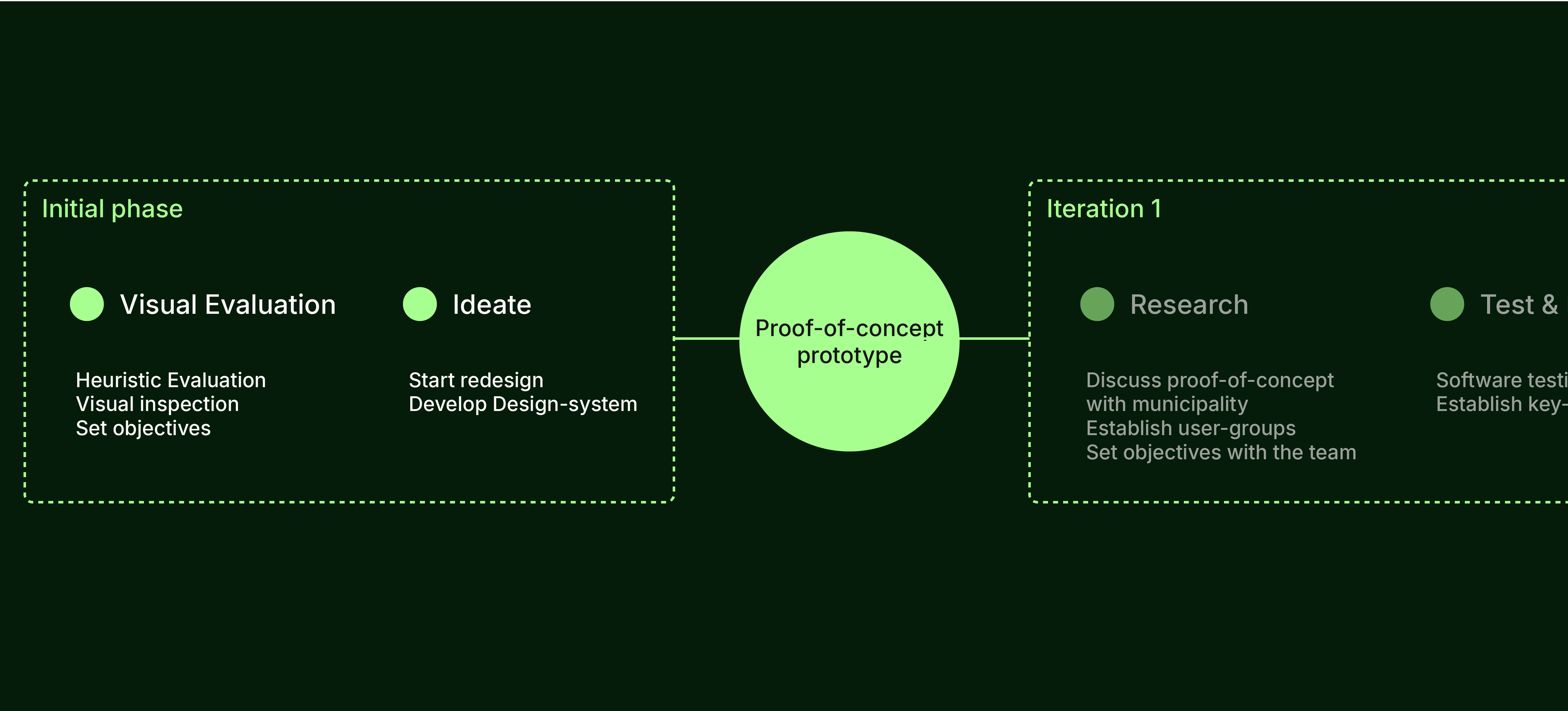
For the redesign, I opted for an iterative process that builds upon the current mobile application as its foundation. This approach enables us to identify and retain effective elements while systematically improving areas of weakness. Before we can start with the iterative process, an initial exploration is done before pitching the idea towards the Gemeente Groningen.
Project Goal
Setting Objectives
As a resident of Groningen and a frequent user of the Afvalwijzer application, I saw an opportunity to contribute to a product I rely on weekly and make a meaningful impact on my local community. The redesign aimed to achieve the following objectives:
- Key Feature Evaluation: Analyze the core features of the current app and assess their usability and functionality.
- Proof-of-Concept: Leverage insights from the evaluation to create a redesigned app with a cohesive design system.
- Prototype Development: Build a prototype to serve as a tangible tool for presentations and pitching ideas.
- Collaborate with the Municipality: Present the initial concept to initiate discussions on potential improvements and gather feedback from key stakeholders.
Visual Evalution
Usability Heuristics
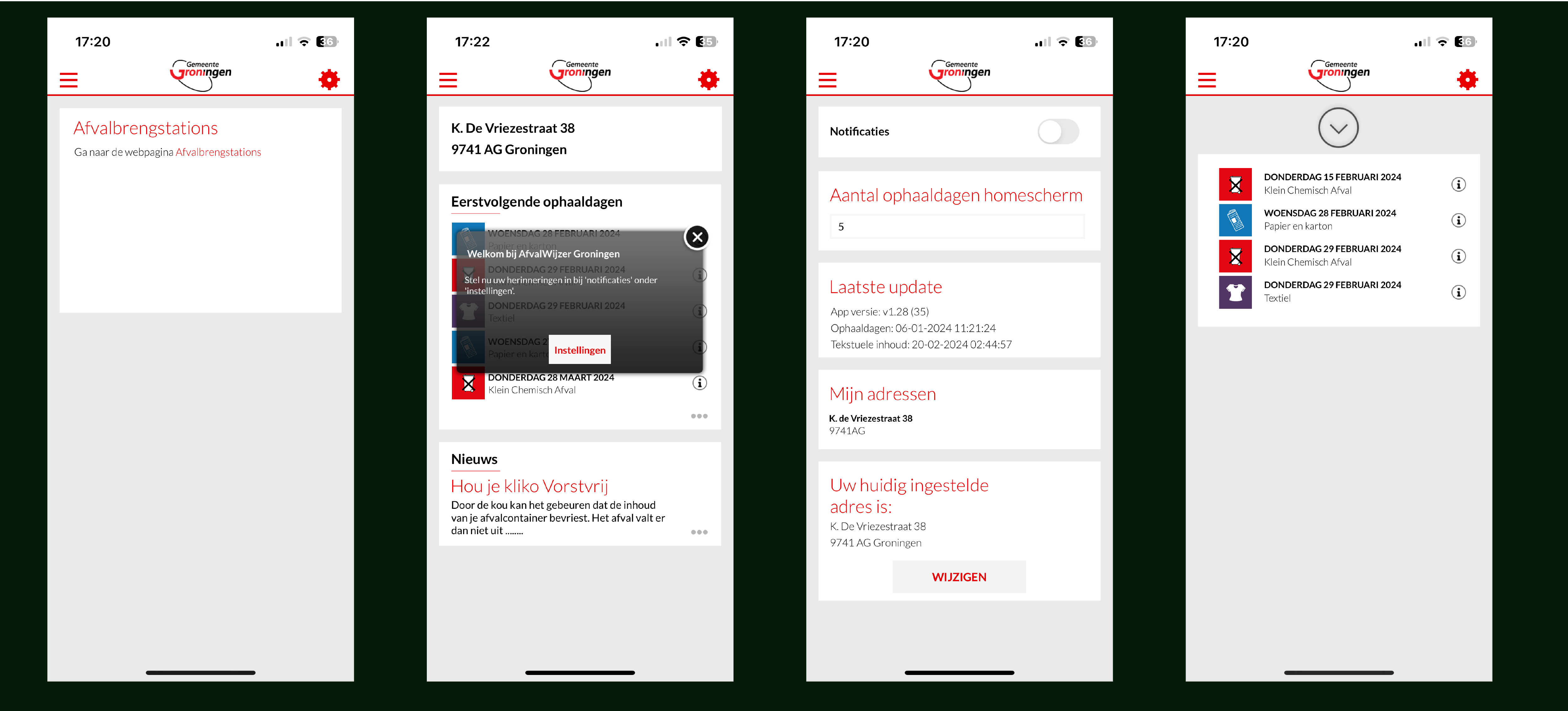
To begin the redesign process, a visual evalution has been coducted based on the current design of the app. Screenshots of the app were made and organised in a Figma file and evaluated using Jakob Nielsen’s 10 usability heuristics.
Read more about Jakob Nielsen’s 10 usability heuristics
Design System
Establishing coherence
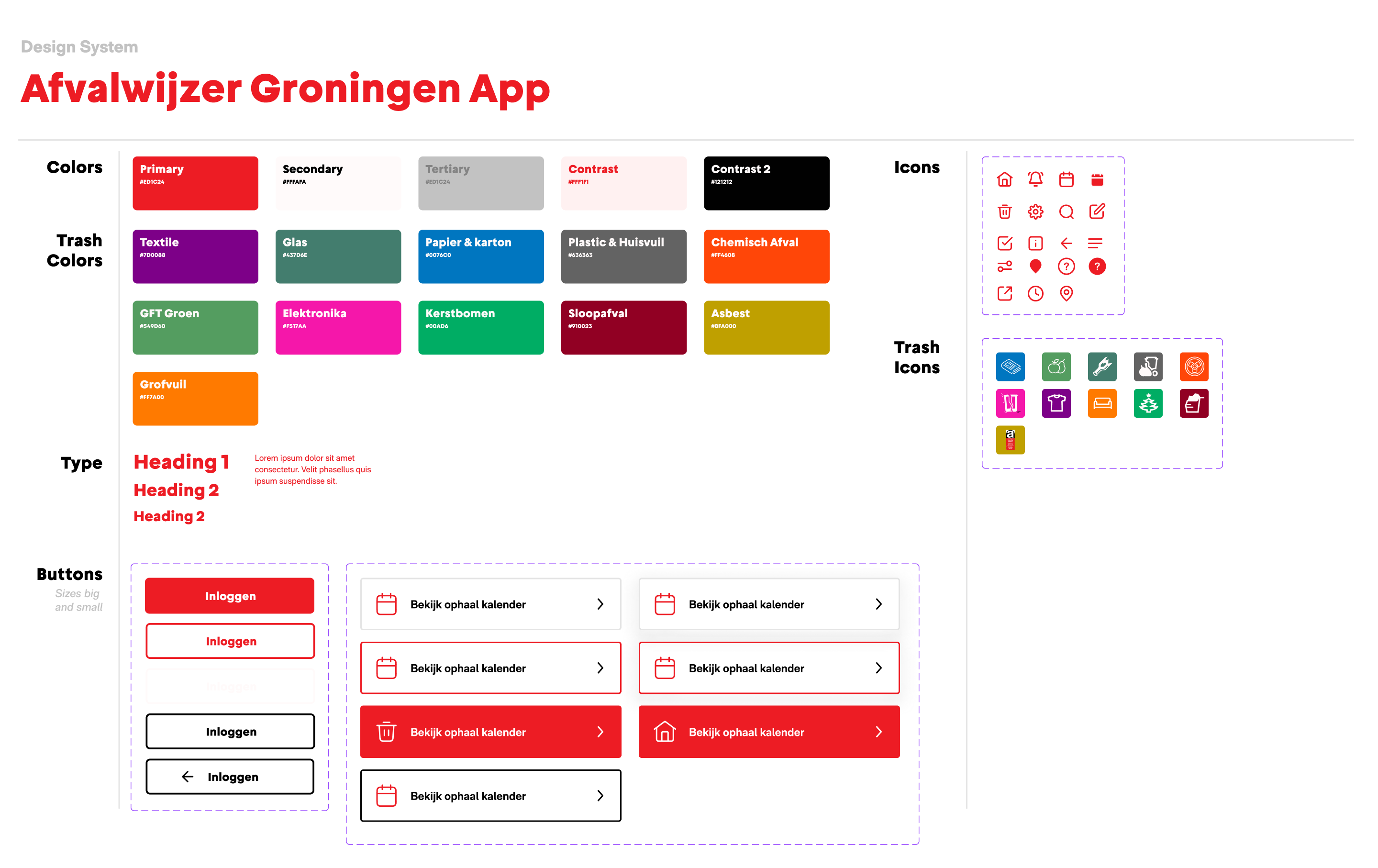
To establish coherence in the design, a foundational design system was developed for consistent application across screens and functionalities. Additionally, plans include integrating the NL Design System in the future.
Read more about NL Design System
Start of redesign
Proof-of-concept prototype
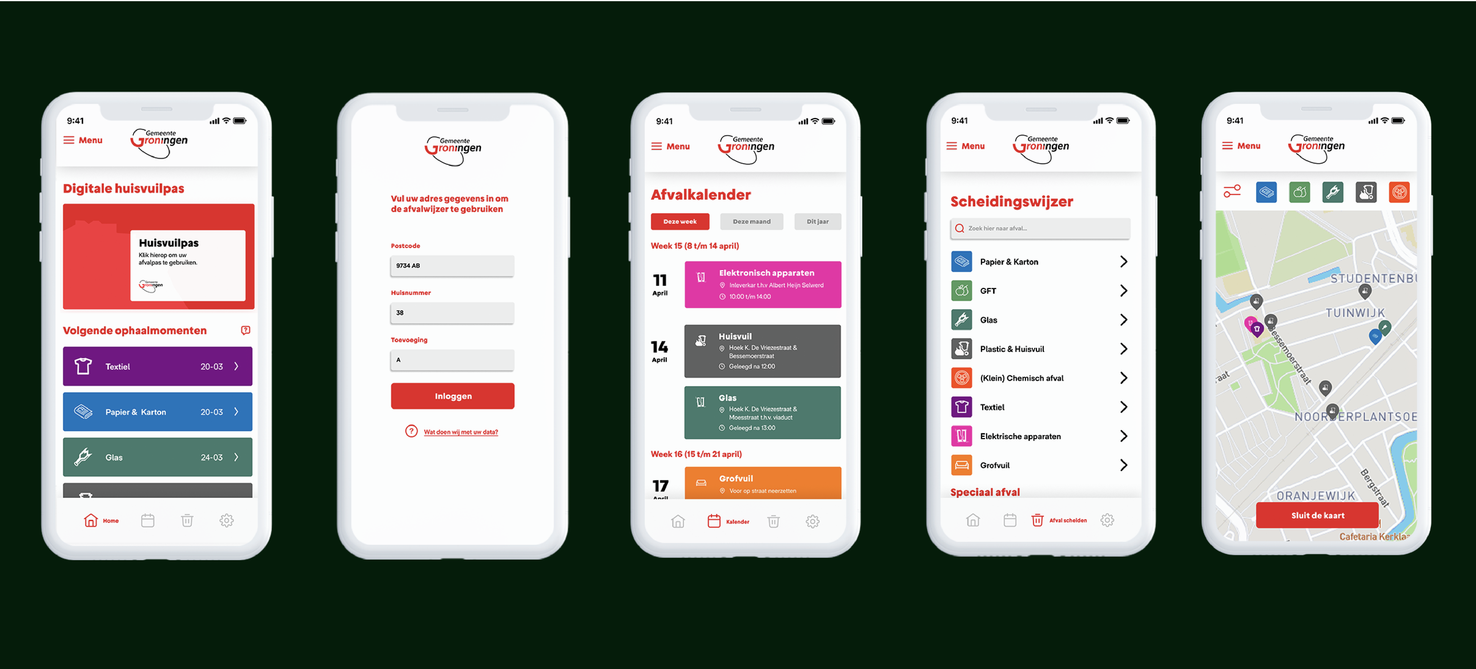
After developing a design system, we proceeded with the redesign of several key screens within the app. The outcomes of these efforts are showcased below.
The first prototype can be seen here
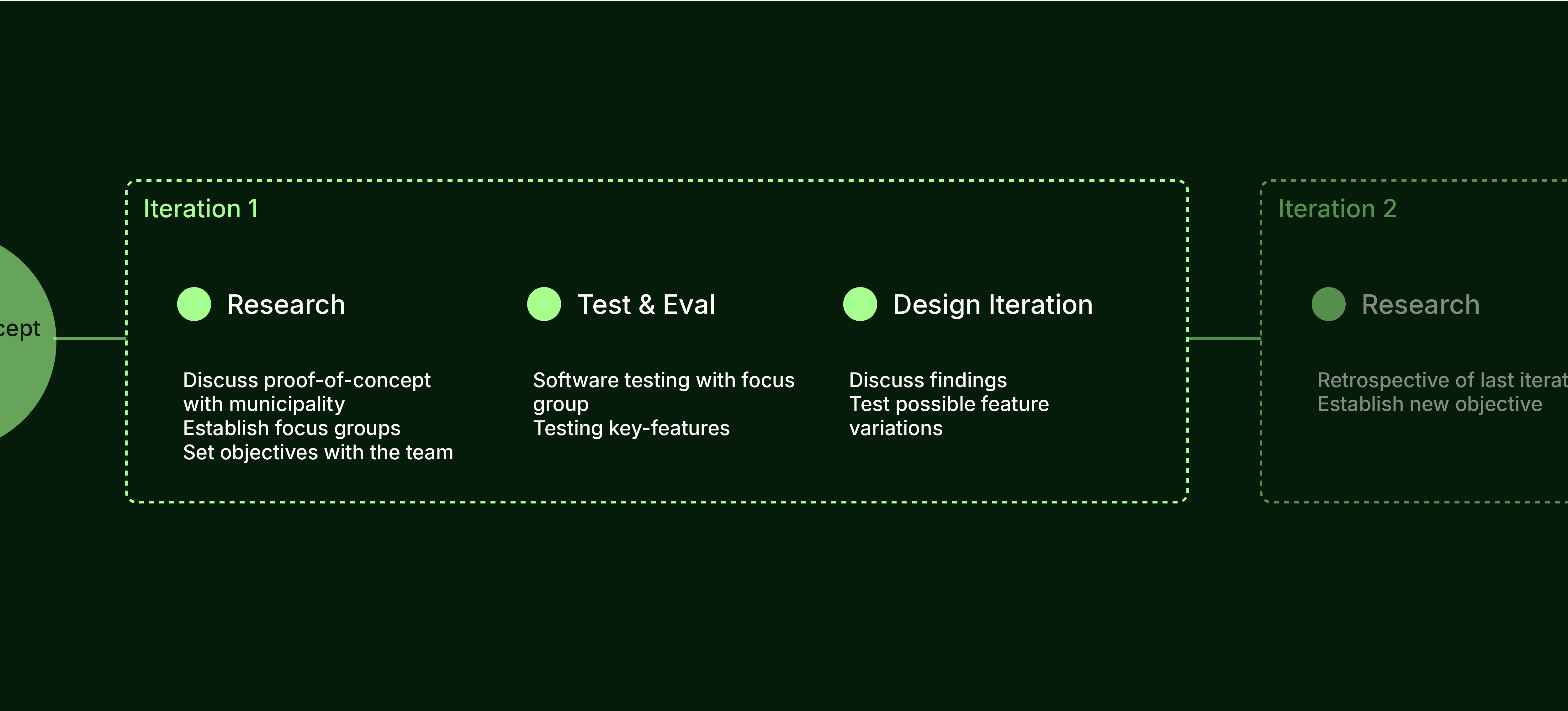
Iteration
Evaluation and reiteration
After completing the initial proof-of-concept, we planned the first iteration of the redesign. This phase aimed to test the application's key features and gather initial feedback from potential users. To achieve this, a focus group of target users was established, providing a structured feedback loop for testing and evaluation.